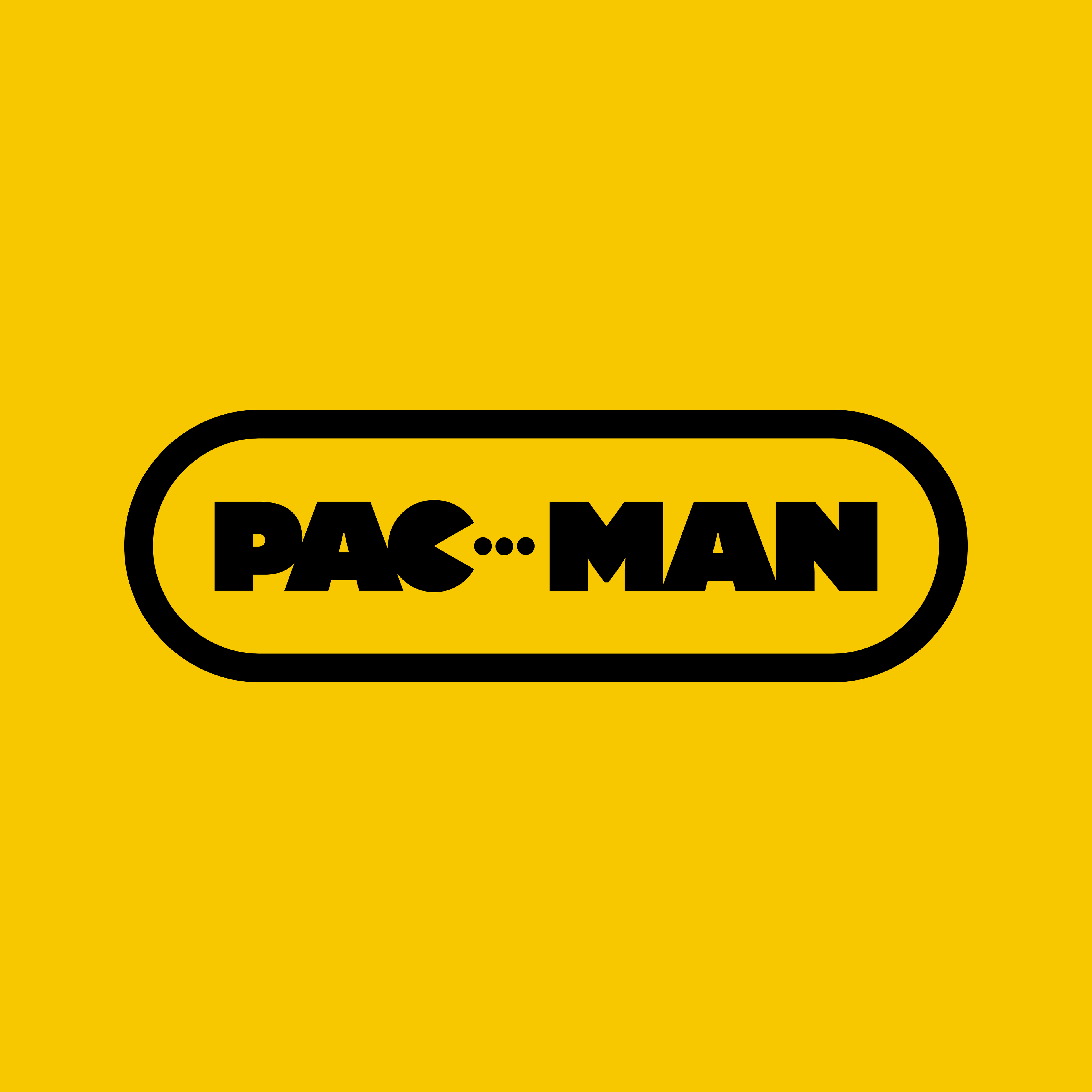
Pac-Man Modernised Logo
- 75 words
- |
- 1 minute read
A little while back, I used to spend my lunchtimes creating inventively titled "Lunchtime Creations". These quick 20-minute designs were good fun, but I fobbed them off in favour of stretching my legs and touching some grass. However, it was raining the other day, and inspiration struck.
I thought it'd be interesting to redesign the Pac-Man logo for a modern age quickly. Blocky sans-serif font. Tick. Remove the character from the original. Tick. Nailed it.
Thank you for taking the time to read this! If by some chance you enjoyed it, and would like to support my whatever this is, then please leave a tip on Ko-fi